Client
Jodie Jenkinson
Year
2020
Media
Tableau
Adobe Illustartor
Audience
Educated Lay Public
About
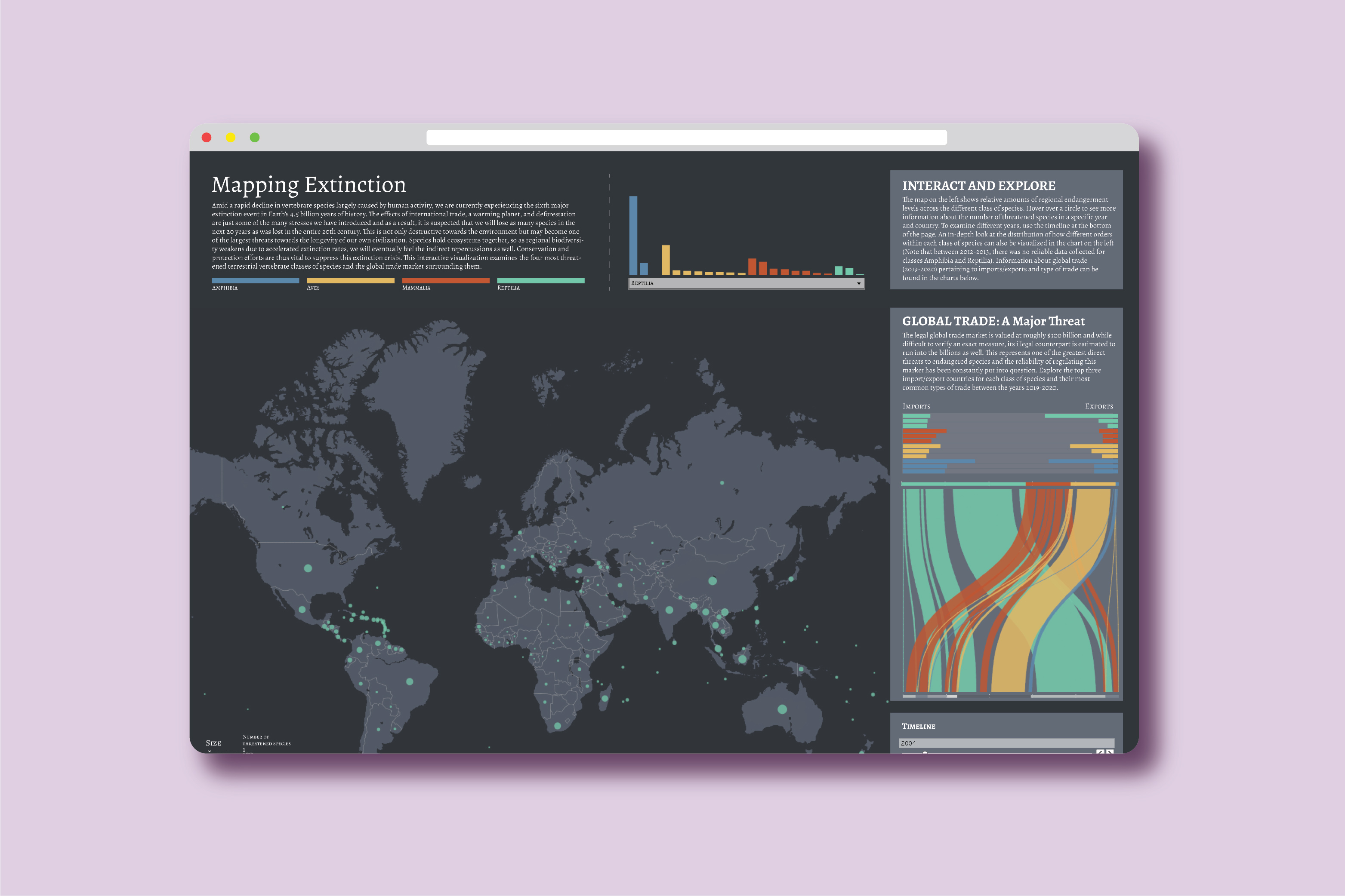
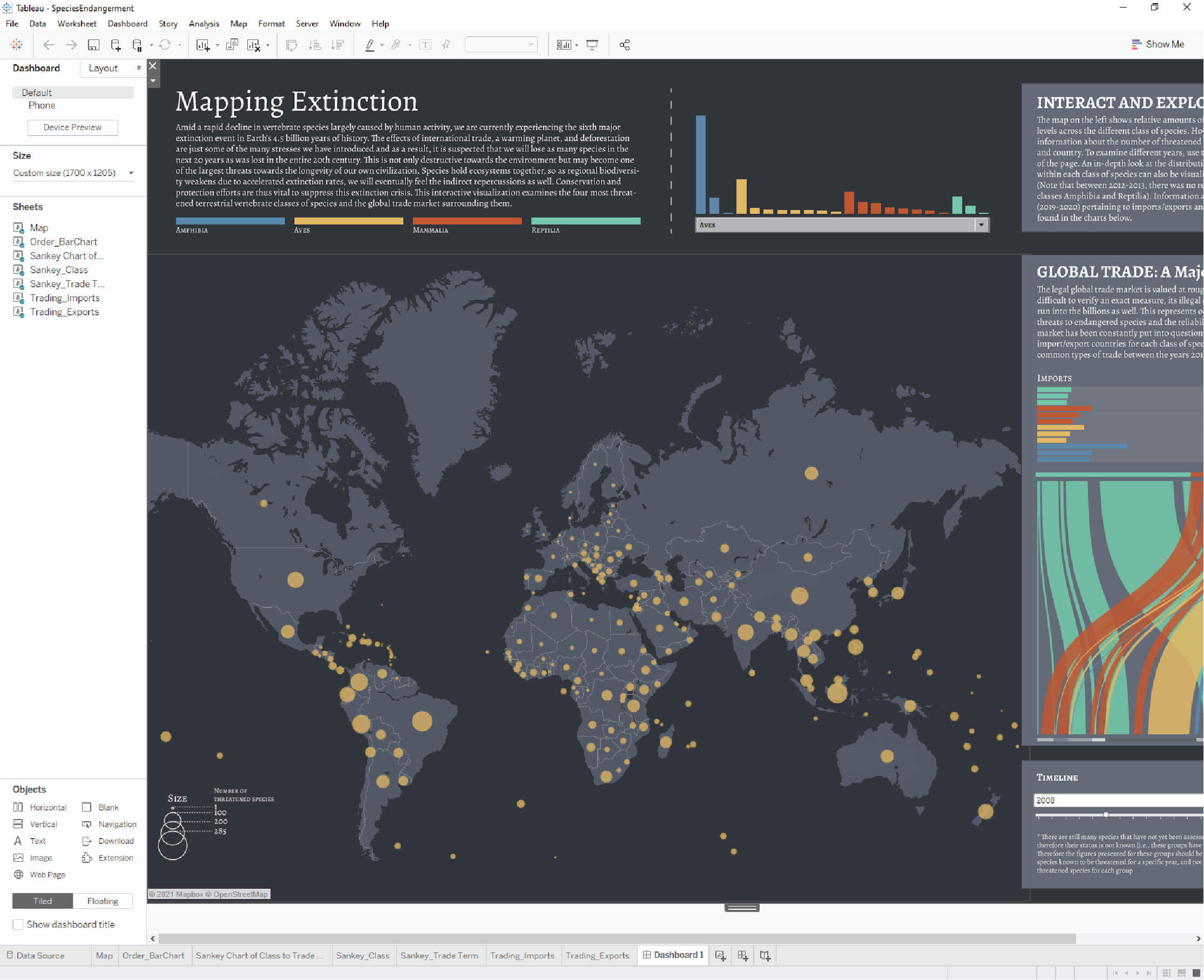
This project was an interactive data visualization created to examine the number of critically endangered and threatened species of animals between 2000 - 2020 and also visualize data on the trading between the animals. Data was taken from Red List IUCN and CITES. This project was also submitted to the 2020 Student Iron Viz international competition and was recognized as one of the top 3 data visualizations. You can view the full interactive project here.
Final interactive piece
Process
Research & Compiling Data
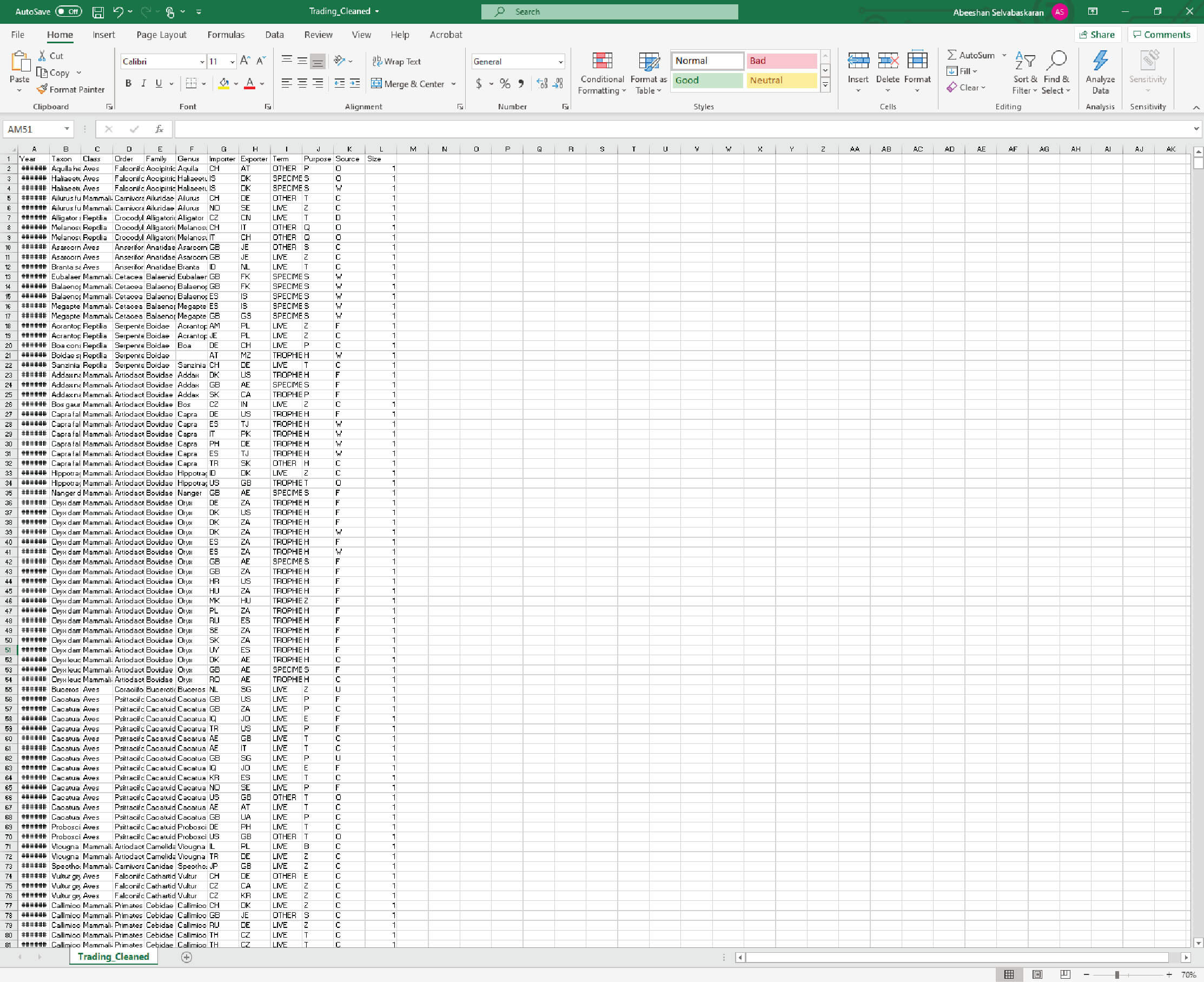
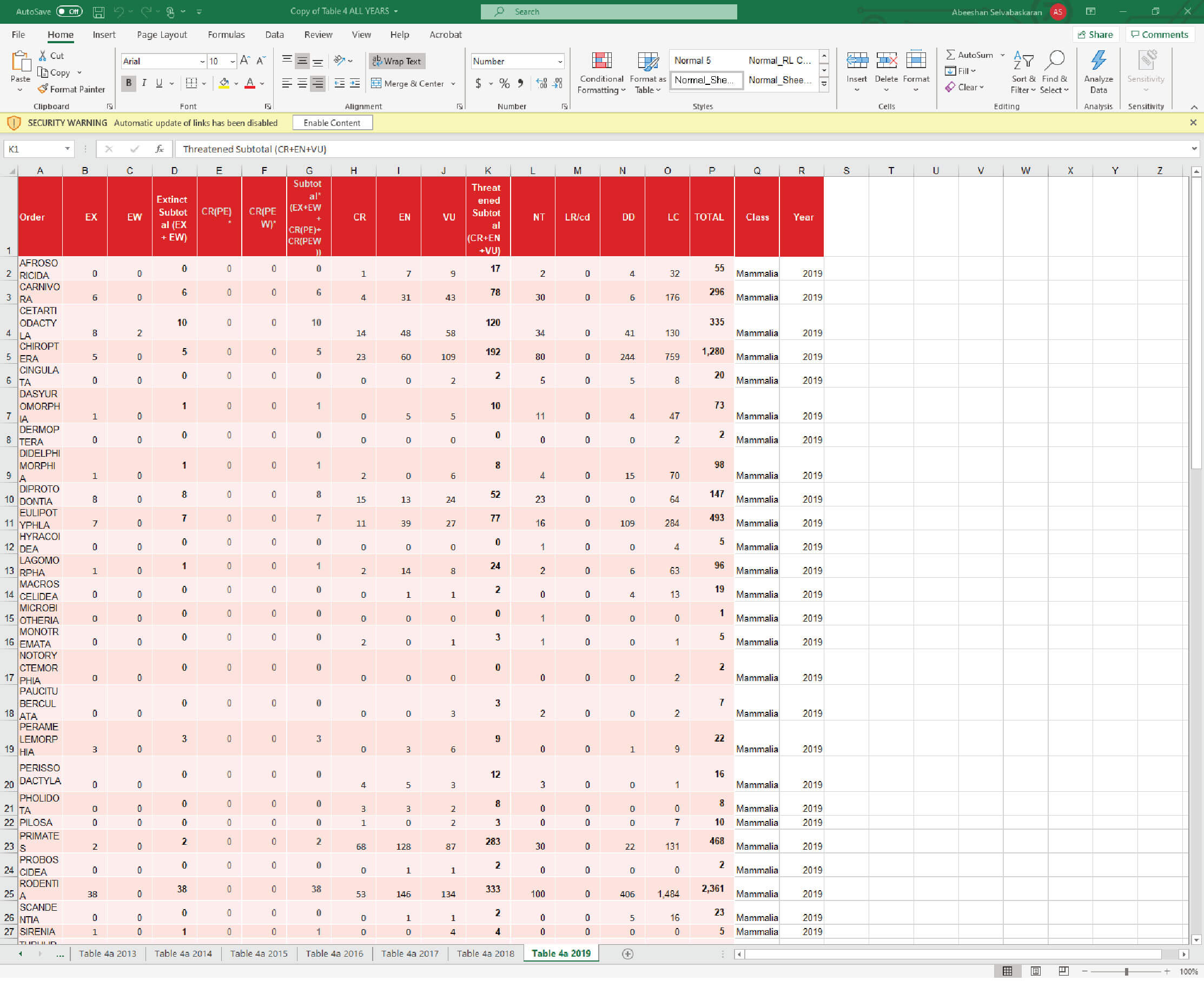
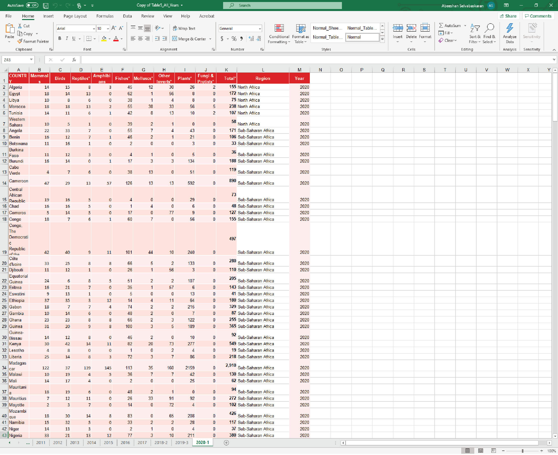
Over 12, 000 points of data were collected between the Red List International Union for Conservation of Nature (IUCN) and the Convention on International Trade in Endangered Species of Wild Fauna and Flaura (CITES). Data was obtained on critically endangered and threatened species of animals (for the classes animalia, aves, mammalia, and reptilia) between 2000 and 2020. Trading data was obtained for 2019.
Data obtained from IUCN and CITES, organized in Excel
Layout Design
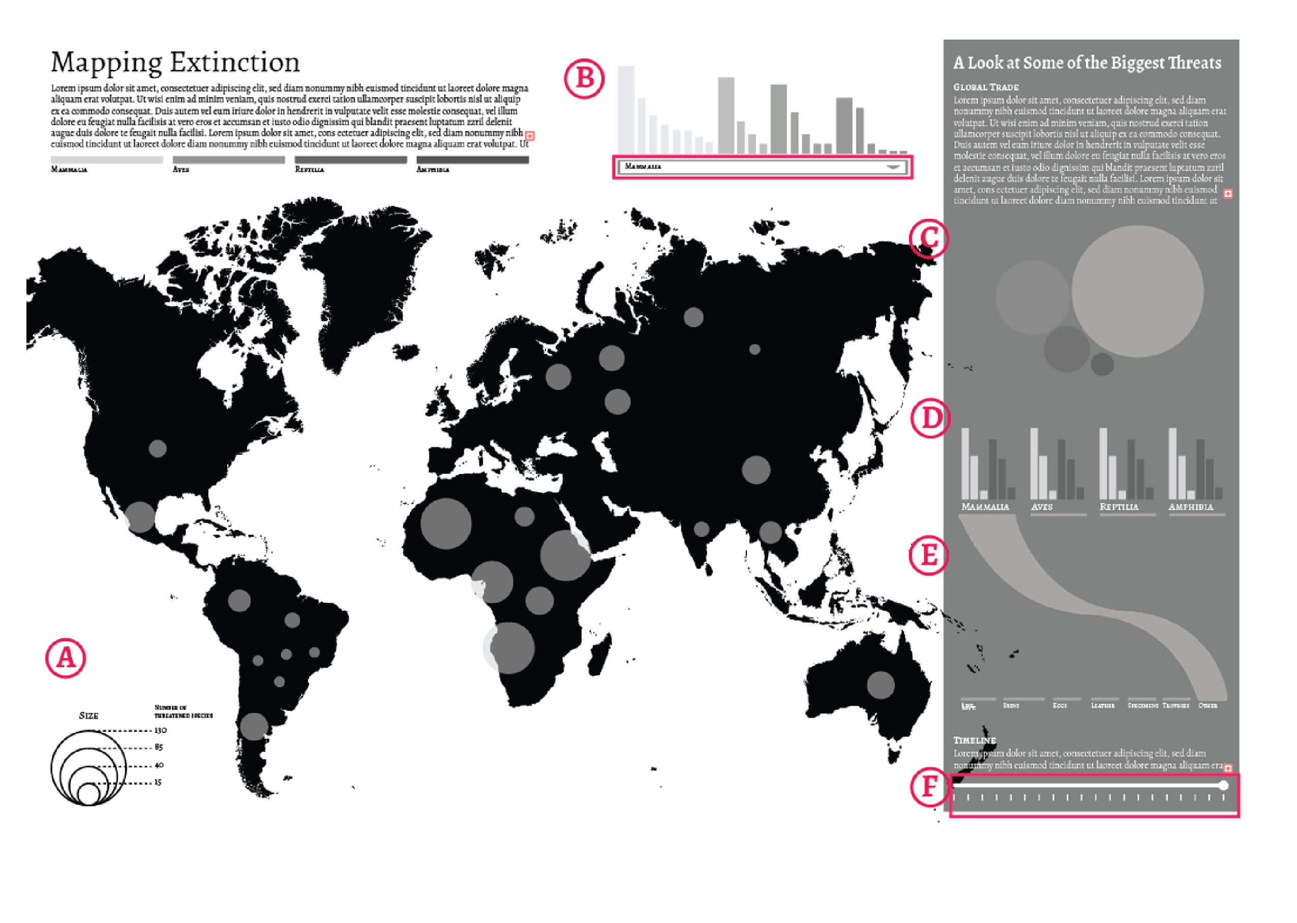
Black and White Rough Layout
- A Geographic Location of Threatened Species (Interactive – Filter can be applied for different animal classes) and the number of threatened species based by country
- B Proportion of threatened species in each class by order (smaller bars represent order of species from each class [represented in thicker bars])
- C 'Packed Bubbles' Graph illustrating the different classes of species as affected by global trade
- D Bar graphs representing the top 3 importers and exporters of each class of species from trade (white = import, dark grey = export)
- E Alluvial Diagram showing what type of products these different classes of species get traded as (alluvial diagram not complete)
- F Interactive Timeline to scroll through that will affect the map data and order of species bar graph data
Note: Red boxes indicate where interactive elements are. Interactive element near the top will be a drop-down menu to select between 'Mammalia', 'Aves', 'Reptilia', and 'Amphibia' – these selections will update the map with appropriate markers corresponding to that class of species. The interactive element near the bottom will be a scrub-able timeline which will update the contents of panel A and panel B.
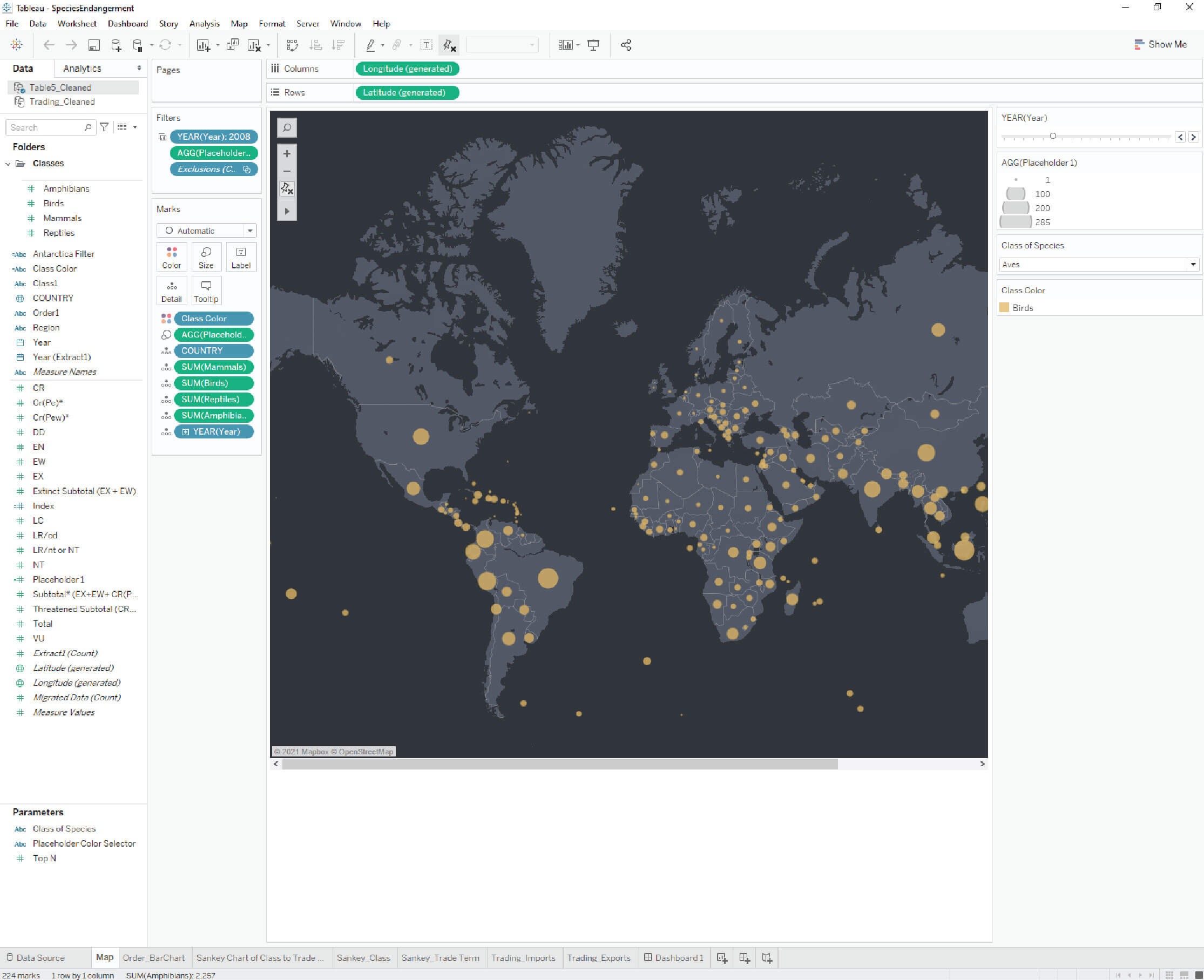
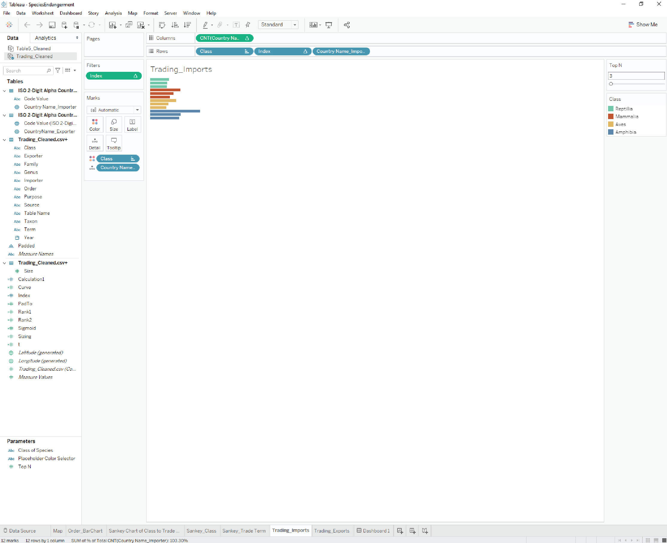
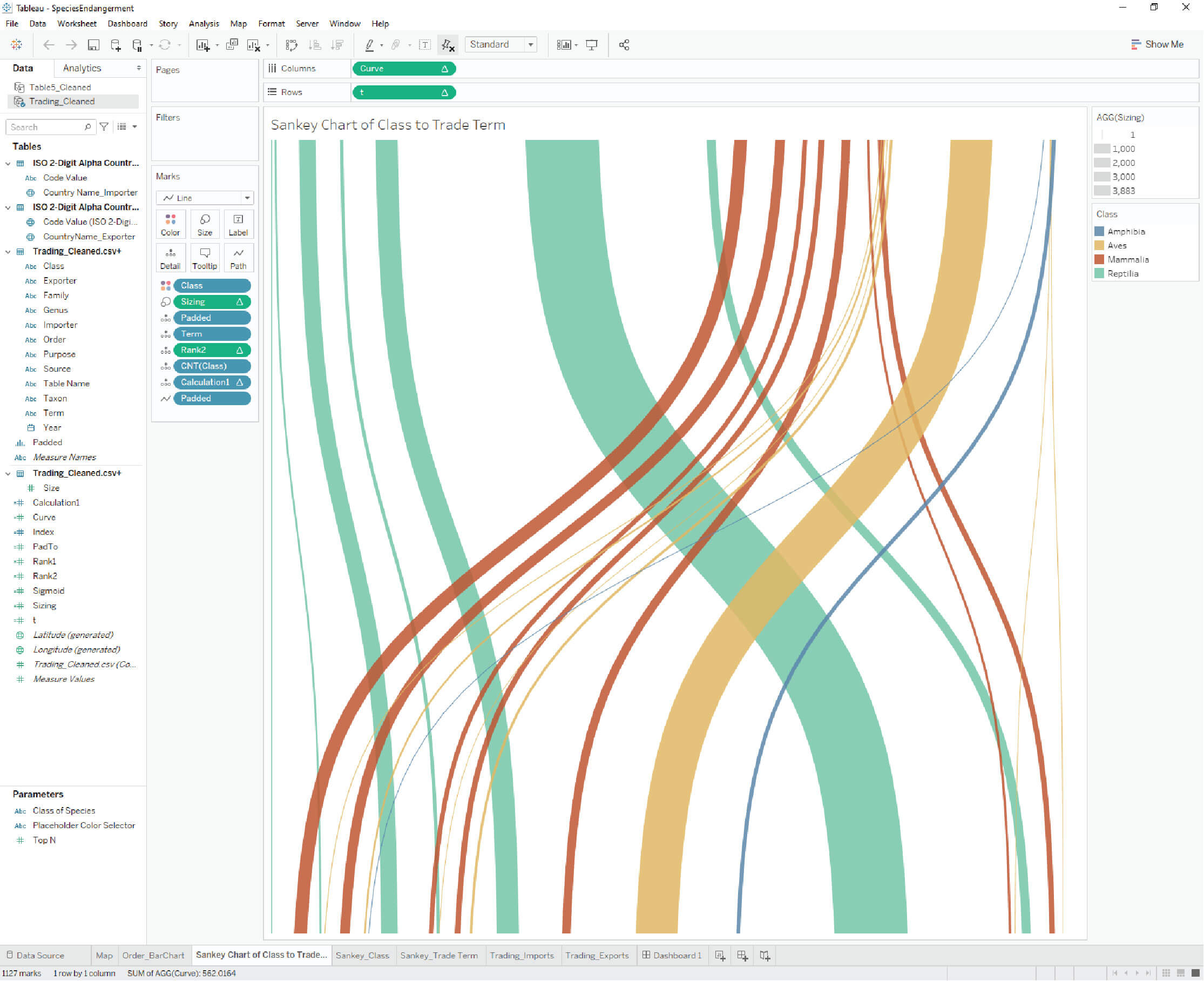
Data Integration
Following revisions from faculty and fellow students, the final draft was integrated into Tableau and rendered out in a single dashboard. A cohesive connection between the different charts was necessary for a comprehensive view of the large dataset so interactive elements that could control multiple charts were implemented (E.g. the timeline scroll bar). Finally a darker color scheme was chosen that would highlight the different animal classes easily.
Integration of Data into Tableau
References
- Cites trade database. UNEP-WCMC. (n.d.). Retrieved February 22, 2022, from http://trade.cites.org/
- The IUCN Red List of Threatened Species. IUCN Red List of Threatened Species. (n.d.). Retrieved February 22, 2022, from https://www.iucnredlist.org/resources/summary-statistics